Why do colors look different on screen than when printed?
Colors are an important part of branding when you start packaging your products. If you have ever printed something from your home printer, you might have noticed that the colors that appear on printed paper are slightly different and duller than you have viewed on your computer screen. Our goal here is to help you understand the differences between color systems, other factors that affect your print outcome, and how to ensure your brand colors are accurately represented.
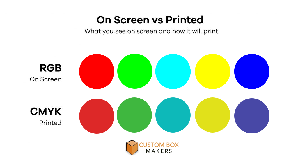
Color System Differences
The colors that you see on your screens are the different ones that you print out on paper.
On-screen
The colors that you see on the screen use the RGB color system. These colors are made by mixing the combinations of 3 colors: red, green, and blue. Screens can display RGB colors only through digital means.
In print
The colors that are printed are usually CMYK color system. This color system is made up of 4 colors of ink together: Cyan, Magenta, Yellow, and Key (Black).
The colors are the same as those on your home or office printer ink cartridges!
In addition to CMYK, another widely used color system is the PMS (Pantone Matching System), often referred to simply as Pantone. Pantone colors are spot colors, meaning they are pre-mixed inks used mainly for precise brand colors and for hues that are challenging to achieve with CMYK, like very bright or metallic colors. Although Pantone colors are costly than CMYK, they are perfect for ensuring consistent and accurate colors in every print run.
Screen & Software Differences
CMYK on Screen vs. in Print
When creating packaging designs in Adobe Illustrator, be sure to set the document color mode to CMYK and provide the closest preview to the final printed result. However, CMYK colors on the screen are still generated by light, leading to variations from the actual printed colors due to ink and paper properties. Additional settings within Illustrator can further adjust CMYK color profiles, resulting in subtle differences in appearance.
Device and Display Variations
Colors can vary significantly across different devices and screens. Even simple adjustments to brightness, contrast, or night mode filters can alter how colors appear. Color representations can also differ between device types (e.g., smartphones, laptops, TVs) and even specific models.
Key Takeaway:
Be aware that on-screen color representations, even in CMYK mode, are not always an exact match for printed results. It’s essential to consider the impact of device and display variations when designing for print.
Paper Material Differences
The choice of paper material (substrate) can significantly influence color appearance:
Bright vs. Dull White Paper: Colors appear more vibrant on brighter white substrates, while duller whites can mute color intensity.
White Paper vs. Brown Kraft Paper:Colors will look duller when gets printed on brown kraft and more earthy compared to white paper.
Textured or Uncoated Paper: The porous nature of these materials can lead to uneven ink absorption, resulting in variations in color and print quality across a single sheet.
Coated Paper: The coating prevents ink from being absorbed into the base paper, ensuring even distribution and a more crisp, vibrant print result.
Printer Differences
The type of printer used significantly affects color reproduction and print quality:
Offset Printers: The ink is transferred indirectly via a rubber sheet, producing the highest quality prints with vibrant colors, sharp details, and crispness.
Flexo Printers: Direct ink transfer to the substrate, similar to stamping, results in lower print quality compared to offset, making it challenging to achieve detailed designs and multiple colors.
Digital Printers: Utilizing toners and cartridges, these printers are limited to CMYK colors and can struggle to match the consistent quality and color accuracy of offset printing.
How to Ensure Color Accuracy and Consistency
Maintain unique color options for digital (e.g., website) and print (e.g., packaging) assets to account for inherent differences in color reproduction.
CMYK for Print Design
Always utilize CMYK color mode when designing for print media, including packaging. Following dieline design tips ensures print-ready artwork files.
Print Proof Verification
Due to the numerous factors influencing printed color, obtaining a digital print proof on the intended substrate is highly recommended. This 2D print out serves as a visual reference for production color matching, ensuring accuracy.